JDKRUEGER&COAcademySign inDE
Module 1 of 4 · Microsoft Clarity for CRO

Clarity as a Behavioral Lens

⏱ 25 min · After completing this module, you'll be able to position Microsoft Clarity as a qualitative complement to GA4 and use heatmaps, scroll maps, rage clicks, and dead clicks as sources for hypotheses - knowing that Clarity reveals patterns but proves nothing, and that you always need to ask about sample size rather than sifting through session recordings yourself.
← Microsoft Clarity for CRO Clarity as a Behavioral Lens 1 / 23
continuing in 5
Start

Clarity as a Behavioral Lens

Why Microsoft Clarity broadens your view of user behavior, and what that means for your CRO decisions.

Qualitative Insights into User Behavior
Transcript of this slide

Welcome to the Clarity track. Analytics tells you what happens. Microsoft Clarity shows you how it happens. In this module, you'll learn how to use this qualitative tool effectively as a decision-maker.

Learning objective

Learning Objective

You'll understand the difference between quantitative and qualitative data.

  • You'll recognize when Clarity is the right complement to Analytics.
  • You'll define requirements for your team to run targeted Clarity analyses.
1
Quant vs. Qual
2
Placing Clarity in Context
3
Setting Requirements
Transcript of this slide

After this module, you'll know why Clarity isn't an alternative to GA4, but an important complement to it. You'll learn how to strategically commission and interpret qualitative data.

Concept

The Problem with Pure Numbers

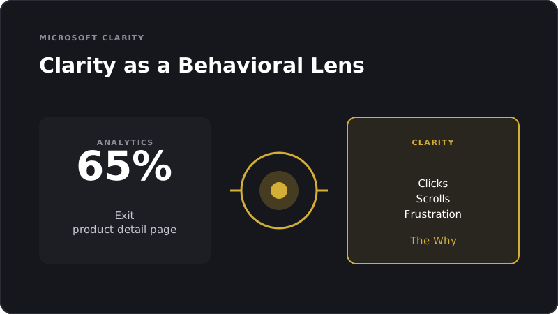
GA4 tells you: 65 percent of users drop off on the product detail page.

  • GA4 doesn't tell you: why they drop off.
  • Clarity makes behavior visible: clicks, scrolls, rage clicks, dead clicks.
Numbers show the what. Clarity shows the why.
Transcript of this slide

Quantitative data without qualitative context often leads to the wrong diagnosis. A high bounce rate can have many causes. Clarity helps identify the most likely one.

Concept

What Clarity Actually Delivers

Heatmaps: Where do users click and move on a page?

  • Scrollmaps: How far do users scroll, and where do you lose them?
  • Session recordings: Individual user journeys played back as video.
  • Rage clicks and dead clicks: Where users click out of frustration.
1
Heatmaps
2
Scrollmaps
3
Recordings
4
Rage Clicks
Transcript of this slide

These four elements are the tools Clarity provides. As a decision-maker, you don't need to read every heatmap yourself. But you do need to know what insights your team should be drawing from them.

Example

Example: The Invisible CTA

A shop has a call-to-action on the product detail page placed below the fold.

  • The scroll map shows: 60 percent of mobile users never reach the button.
  • The heatmap shows: users who see it click it. The problem is visibility, not the button itself.
Scroll Drop-off Before the Call-to-Action
Transcript of this slide

This is a classic Clarity result. Without the scroll map, you might have optimized the button itself: color, text, size. With Clarity, you can see that the problem starts much earlier: it's a visibility issue.

Concept

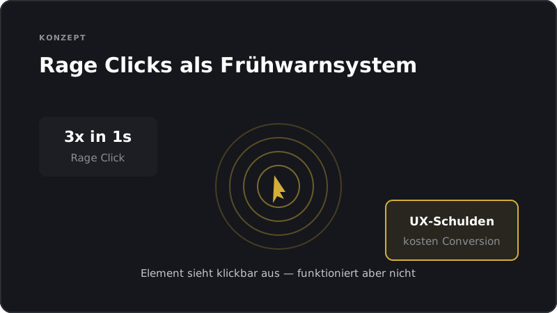
Rage Clicks as an Early Warning System

Rage clicks occur when users click on an element multiple times in rapid succession.

  • They signal frustration: something looks clickable but doesn't work.
  • For decision-makers, rage clicks are an indicator of UX debt that's costing you conversions.
Rage Clicks Reveal Hidden Frustration
Transcript of this slide

Rage clicks are especially valuable because they make a real emotion visible. A user who's angrily clicking around your page is unlikely to buy. Take these signals seriously.

Concept

Putting Clarity in Context

Clarity is not an analytics tool. It doesn't provide revenue figures.

  • Clarity is not an A/B testing tool. It doesn't prove what works better.
  • Clarity is a hypothesis tool: it surfaces problems and patterns you can test.
1
No Analytics
2
No Testing
3
Hypothesis Tool
Transcript of this slide

This distinction matters. Misunderstanding Clarity leads to the wrong conclusions. Clarity shows you behavior worth testing. It doesn't tell you whether one variant outperforms another.

Scenario

Scenario: Two Interpretations

A product detail page shows a high number of clicks on a large image.

  • Interpretation A: Users love the image and want to zoom in.
  • Interpretation B: Users don't understand the variant selection and are clicking without success.
  • Clarity shows the pattern. A test reveals the correct interpretation.
Spot the Pattern. Test the Cause.
Transcript of this slide

This scenario shows where Clarity hits its limits. It delivers patterns, but no causal explanation. You'll only find the root cause by running a targeted test.

Concept

When Does Clarity Pay Off Most?

On pages with high traffic but low conversion.

  • On new pages or relaunches where performance is still unknown.
  • On existing pages where you need test hypotheses.
1
High Traffic
2
New Pages
3
Hypothesis Phase
Transcript of this slide

Clarity is most valuable where many users are dropping off but the reason isn't clear. It's also very helpful for getting quick feedback after a relaunch.

Concept

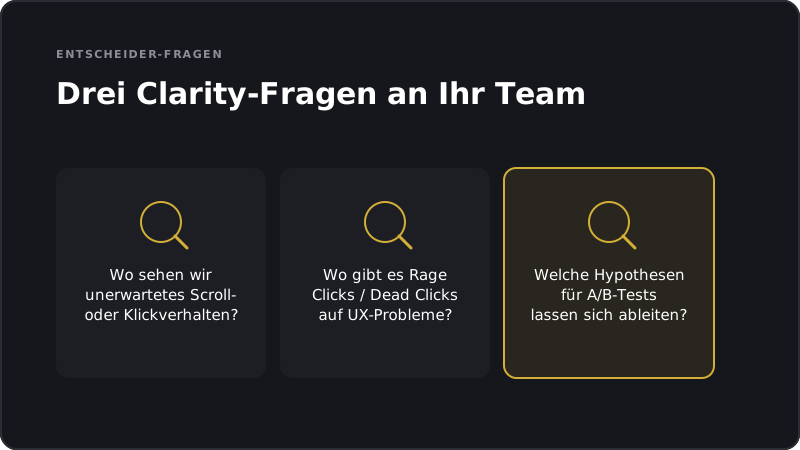
The Decision-Maker's Questions for Clarity

On which pages are we seeing unexpected scroll or click behavior?

  • Where are the rage clicks or dead clicks that point to technical or UX issues?
  • What A/B testing hypotheses can be drawn from the Clarity data?
Three Clarity Questions for Decision-Makers
Transcript of this slide

These are the three questions you should ask your team when they're working with Clarity. They move you from pure observation to concrete actions and test ideas.

Exercise

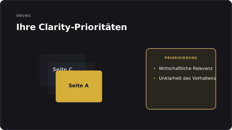
Exercise: Your Clarity Priorities

Write down three pages in your shop where you don't understand user behavior.

  • Rank them by traffic volume and business relevance.
  • For the top page, write out a specific question you want Clarity to answer.
Prioritize Pages for Clarity Analysis
Transcript of this slide

Trying to use Clarity on all pages at once is inefficient. Prioritize by traffic and business relevance. Start with the pages that get the most visitors and have the most unanswered questions.

Concept

The Sampling Trap

Clarity doesn't capture every user. It works with sampling.

  • With low traffic, patterns can be random or unrepresentative.
  • As a decision-maker, always ask about the sample size before acting on what you see.
Captured 30 (30%) Not Captured 70 (70%)
Transcript of this slide

Clarity shows you patterns, but not for every user. When your team interprets a heatmap, ask about the data behind it. A pattern based on a hundred users is a very different thing from one based on ten thousand.

Example

Case Study: The Checkout Scroll Drop

A shop notices in Clarity that users barely scroll to the bottom of the checkout.

  • The scroll map shows a sharp drop-off starting at the payment options section.
  • The hypothesis: payment options are shown too late and too compactly. The test improves their visibility and lifts the conversion rate.
Scroll Drop-Off in Checkout
Transcript of this slide

This is a classic Clarity finding. The problem wasn't the price or the payment method itself. It was visibility. These kinds of insights are valuable for decision-makers because they're fast and concrete.

Common misconception

Myth: 'I need to watch session recordings myself'

Fact: Your team reviews the recordings and brings you the patterns.

  • As a decision-maker, you interpret the patterns and decide what to do next.
  • Spending hours watching videos is not a good use of your time.
Team Delivers Patterns. Decision-Maker Acts on Them
Transcript of this slide

Many shop owners think they need to sit in Clarity themselves. The opposite is true. Clarity is a team tool. Your team brings you aggregated insights, and you make the decisions.

Concept

From Clarity to the Test Pipeline

Step one: Clarity reveals a behavioral pattern.

  • Step two: You and your team form a hypothesis.
  • Step three: The A/B test proves whether the hypothesis holds.
  • Step four: The winning variant gets rolled out.
1
Patterns
2
Hypothesis
3
Test
4
Rollout
Transcript of this slide

This pipeline is the strategic value of Clarity. Without the testing step, you're left with assumptions. With it, qualitative observations become validated improvements.

Summary

Summary

Clarity complements analytics by adding qualitative behavioral data.

  • Heatmaps, scroll maps, and rage clicks generate hypotheses for testing.
  • Clarity doesn't prove anything. It shows patterns that you need to test.
1
Observing
2
Hypotheses
3
Testing
Transcript of this slide

The key takeaway from this module: Clarity is a hypothesis generator. It makes invisible user behavior visible. But the business decision only comes after the test.

Summary

What You're Taking Away

Ask your team for aggregated Clarity insights, not individual videos.

  • Always ask about the data behind it and the sample size.
  • Connect every Clarity pattern to a test hypothesis or action hypothesis.
From Observation to Validated Action
Transcript of this slide

These three habits turn Clarity into a strategic tool. Aggregate, question, test. That's the combination that makes qualitative data actionable.

Intermediate step

What's Next

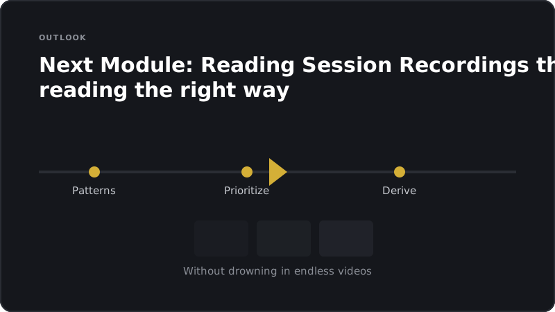
In the next module, you'll learn how to read session recordings properly, meaning how to spot patterns without getting lost in endless videos.

Next Module: Reading Session Recordings
Transcript of this slide

The next module goes deeper into interpreting session recordings. Not every recording is equally valuable, and there are techniques for spotting patterns quickly.

Quiz

Quiz

Test your knowledge.

What is the primary function of Microsoft Clarity for decision-makers?

Which statement about Clarity is correct?

What does a heatmap show particularly well?

What does maturity mean in the context of using Clarity?

Why shouldn't Clarity replace quantitative data?

Exercise

Exercise

Apply what you have learned right away.

  • 1
    Clarity Page Prioritization
    worksheet · approx. 20 min
    List the five most important pages in your shop. Rate each one by monthly traffic, business relevance, and how unclear user behavior is on that page. Then pick the top 2 pages for your first Clarity analysis.
  • 2
    Deriving Hypotheses from Behavior
    reflection · approx. 15 min
    Pick a page in your shop where you suspect a behavioral pattern. Write out three possible hypotheses for why users might be acting that way. Mark which hypothesis is best suited to being tested with an A/B test.
Reflection

Reflection

A quick look back before you continue.

  • Which revenue-critical page in your shop do you understand the least in terms of user behavior - and what would you most like to "catch people doing" there?
  • What assumption about your customers could a rage click or scroll pattern in Clarity disprove?
  • Which of your important pages has traffic so low that you should always ask about sample size before taking any action?
Finish

Module completed

Next Module: How to Read Session Recordings Correctly

Hands-on material to take away

This module comes with two PDF downloads you can apply right away:

  • Job-Aid: The core message condensed onto one page, ideal for quick reference before decisions.
  • Worksheet: A fillable worksheet to adapt what you have learned to your shop.

Overview & learning objective

This module is aimed at shop owners.

After completing this module, you'll be able to position Microsoft Clarity as a qualitative complement to GA4 and use heatmaps, scroll maps, rage clicks, and dead clicks as sources for hypotheses - knowing that Clarity reveals patterns but proves nothing, and that you always need to ask about sample size rather than sifting through session recordings yourself.

Clarity as a Behavioral Lens